
Even the most beautiful maps can be misleading:
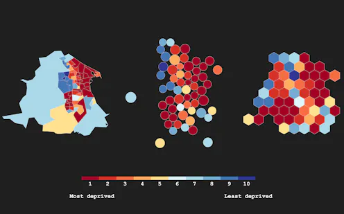
From reporting election results to issuing weather forecasts, maps offer a powerful, accessible and visually appealing way to convey complex information. But as a researcher focusing on data visualisation, I’m aware that even the most beautiful maps can introduce some degree of misrepresentation.
To see how, consider the latest statistics on deprivation released by the UK government. The government ranked 32,844 neighbourhoods, based on measures of deprivation such as income, employment, health and crime. The figures were widely reported, from the BBC to The Guardian and the Daily Mail, reigniting long-standing debates about persistent inequality in England.
Of course, many outlets used maps to share these findings with the public. But using traditional boundaries can divert readers’ attention away from important information. In the BBC’s map of deprivation across local authorities, for instance, sparsely populated rural areas dominate a disproportionately large area, while urban areas, such as London, containing millions of people, are rendered almost invisible.
Distorted data
Recent research shows that people can interpret information inaccurately, when they look at maps with these shortcomings. But other techniques can be used to create a more accurate impression of the underlying data. For instance, cartograms deliberately distort geography by scaling areas according to a specific variable, such as local population.
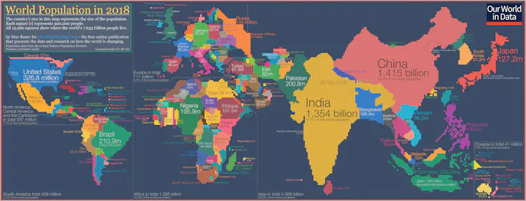
Dorling cartograms take this one step further, scaling areas according to a specified variable, but also representing each area using the same shape, such as a square or a circle. Other methods achieve uniformity in both size and shape: hexograms and geogrids transform the original boundaries of the map into hexagons or squares of the same size, while still aiming to preserve their original arrangement.
Mapping neighbourhood deprivation in England represents a significant challenge, even for experts. This is because the government defines a neighbourhood as a “lower super output area” – each of which contains around 1,500 residents.
Read more: These maps show how tricky it is to measure inequality in local areas across England
Because highly deprived neighbourhoods tend to be densely populated, they are less visible on a regular map. By contrast, wealthier suburban areas – which are often less densely populated and therefore much larger – dominate the map. So there’s a risk that readers might draw inaccurate conclusions about the level of deprivation in any given area.
Shaping up
Using Dorling cartograms scaled by resident population, and regular hexagonal geogrids, I’ve attempted to minimise any misrepresentation. Take the example of Blackpool, which was ranked the most deprived local authority in England. Around 42% of neighbourhoods in Blackpool are in the top 10% most deprived in England (the “first decile”). Yet these neighbourhoods only make up around 29% of the city’s actual area.
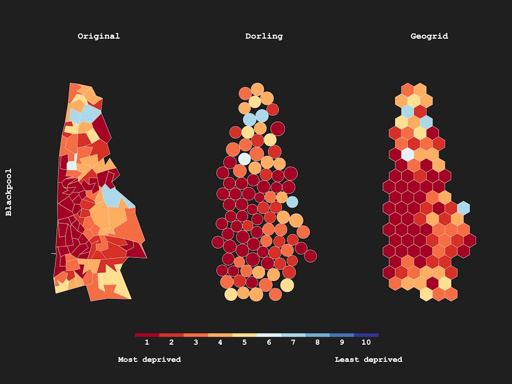
Using a Dorling cartogram scaled by resident population size, neighbourhoods in the first decile now take up 41% of the map’s area, and the larger, less deprived neighbourhoods (in light blue) have been shrunk accordingly to become less dominant. With a regular hexagonal geogrid, the map now mimics the underlying data, with neighbourhoods in the first decile of deprivation taking up 42% of the total area.
The variation in the shapes and sizes of Blackpool’s neighbourhoods can no longer divert attention or mislead readers, and arguably, the underlying data has been conveyed more accurately than with the original map.
Mapping deprivation differently
A striking difference can be seen using different types of maps to visualise deprivation in Burnley and Hartlepool, which were among England’s most deprived local authorities. Both areas are characterised by many small, densely populated neighbourhoods in the first decile (most deprived), surrounded by much larger and wealthier suburbs.
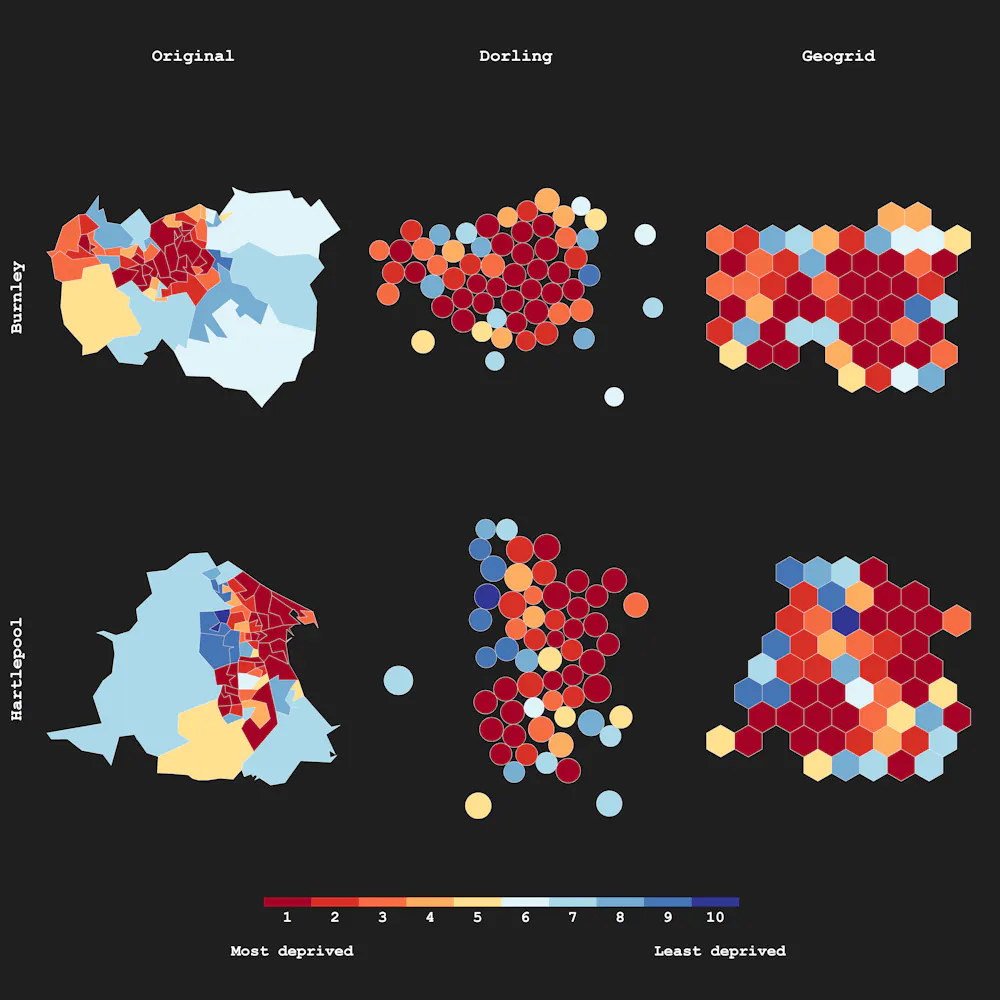
At first glance, deprivation appears understated in the map that uses the original boundaries. But with the Dorling cartogram (again scaled by population) and the hexagonal geogrids, the issue can be somewhat rectified. This comes with its own difficulties, though.
The geogrid in particular pushed some neighbourhoods further apart and forced some closer together than they appear on the original map. This might prove problematic in cases where the primary aim of the map is to convey distinct geographic patterns, such as the clustering of highly deprived neighbourhoods. In making the transformation, these patterns might be lost, or spurious patterns generated.
Encouraging experimentation
Birmingham and Manchester – ranked in the top ten most deprived local authorities – present a different challenge. With much larger populations, and many more neighbourhoods to visualise, the original map presents an overwhelming amount of information.
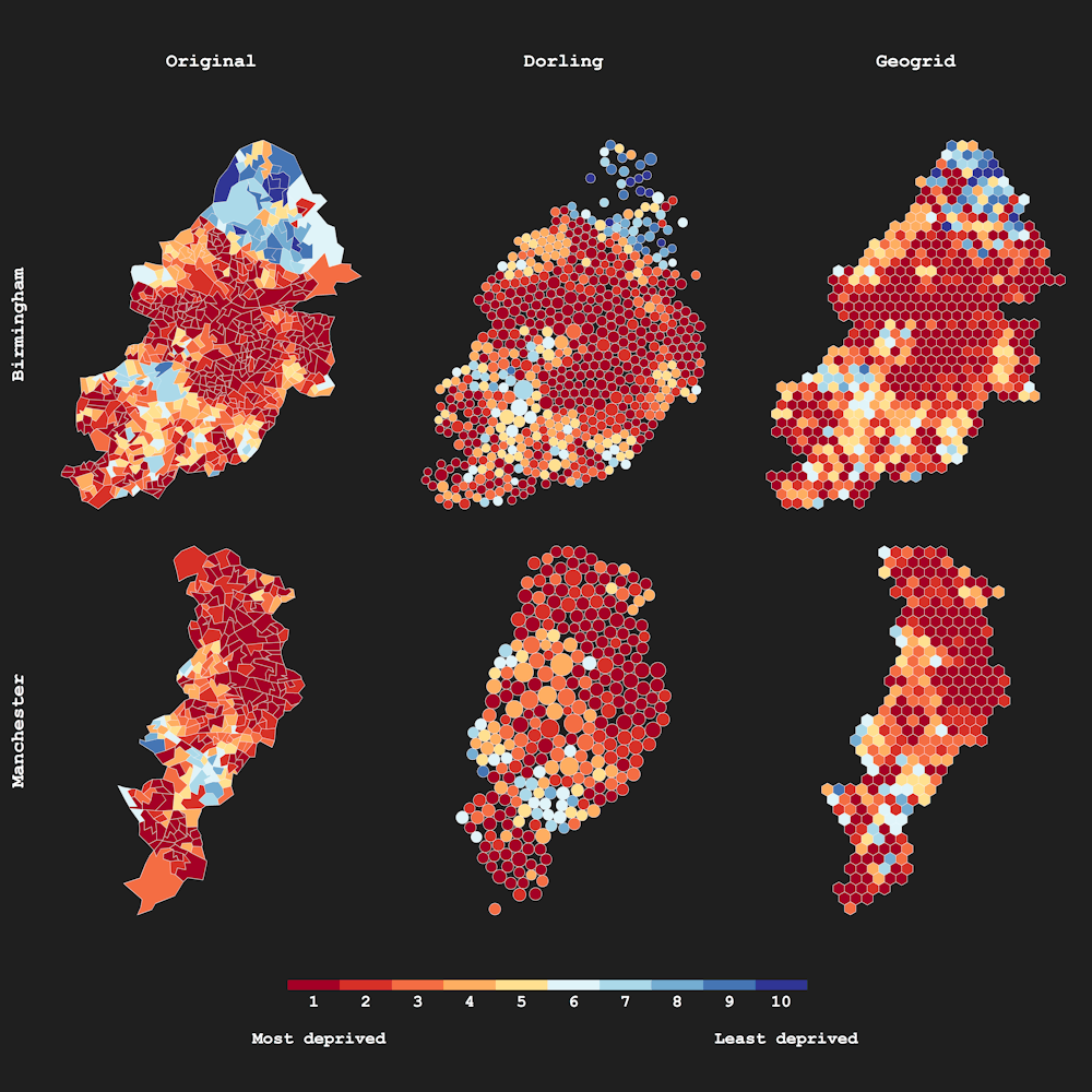
Once again, both the Dorling cartogram and the geogrid perform admirably, scaling down the visual impact of larger, wealthier areas (especially in the north of Birmingham) and making the maps easier to read – without skewing the geographic patterning of deprivation across each city.
There are no firm rules about how best to create beautiful but accurate maps. In this case, using the latest neighbourhood deprivation data in England, mapping out the original boundaries can clearly introduce some degree of misrepresentation. There’s real value in experimenting with different cartographic techniques – and media organisations and the government would do well to think outside the box when it comes to sharing the latest findings with the public.

Samuel Langton does not work for, consult, own shares in or receive funding from any company or organisation that would benefit from this article, and has disclosed no relevant affiliations beyond their academic appointment.
: The Conversation – Articles (UK)
Have you tried: Farking?